
Friday, 14 December 2012

Wednesday, 12 December 2012
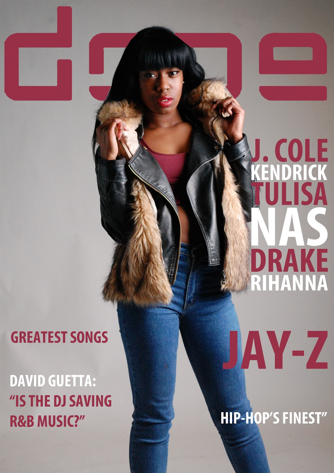
DPS Interview
Gen Williams is realised her second album this November, and Dope magazine has a chance to hear about what Gen will be doing next. Gen has been touring around America, Australia, Canada, Japan and she has finally reached the UK. Also, gen has won the best female rapping award this October. She was underground before as she use to write songs for artist such as Beyonce, Kelly Rowland, and Mary.j bilge and now she has the biggest star alive! Gen will be revealing what artist she will be working with next and what her next album will be called.
Well it’s not different from writing for other people as i always make sure put 100% towards that I’m working on. Singing has been very challenging which was probably the hardest thing i had to do ever since i was young but I’m starting to enjoy it and I’m no longer as shy as I use to be. Touring has probably got to be the best part about this lifestyle. Going to different countries within a month makes me feel like I’m the luckiest girl alive. I love seeing people from all over the world enjoy my music it makes feel like I’ve achieved so much
For the fans that want to be as successful as you what advice would you give them?
Dope: So we finally meet the famous Gen, how does it feel to be in the UK
Gen: aww I’m very flattered..I’m still not use to being called famous. I get shy every time someone says something like that (giggles).. The UK is actually a wonderful place; it’s very different from other countries I’ve been touring at.
Gen: aww I’m very flattered..I’m still not use to being called famous. I get shy every time someone says something like that (giggles).. The UK is actually a wonderful place; it’s very different from other countries I’ve been touring at.
How does it feel to be recognised by everyone now, and has your life changed since you have realised your album, if you yes are enjoying it?
Well being recognised is very overwhelming as it was my dream to become a singer but being on the spot light is just not me.. As I’m very shy but I’m working it on. It just happened so quickly- it’s very hard adjusting to my new lifestyle. Sometimes I still feel like I’m dreaming. My life has changed so much, I miss being the normal girl I use to be as I am very busy now but I don’t regret anything and I’m always thanking god. I love touring around the world as i get to see people from a every culture that love my music
Well being recognised is very overwhelming as it was my dream to become a singer but being on the spot light is just not me.. As I’m very shy but I’m working it on. It just happened so quickly- it’s very hard adjusting to my new lifestyle. Sometimes I still feel like I’m dreaming. My life has changed so much, I miss being the normal girl I use to be as I am very busy now but I don’t regret anything and I’m always thanking god. I love touring around the world as i get to see people from a every culture that love my music
What made you decide to finally start singing?
I was inspired by Beyonce as most people around the world know her because of her talent. I wanted to finally become who i always wanted to be become, as i was only writing song i wasn’t really achieving my dreams. So one day I must have made a YouTube video just to see what people thought about me singing.. I didn’t take it serious as I thought no one would like my music. After couple of days the video got a million hits that’s how it all began. Also the support of my family is what thrived by confidence to start singing.
I was inspired by Beyonce as most people around the world know her because of her talent. I wanted to finally become who i always wanted to be become, as i was only writing song i wasn’t really achieving my dreams. So one day I must have made a YouTube video just to see what people thought about me singing.. I didn’t take it serious as I thought no one would like my music. After couple of days the video got a million hits that’s how it all began. Also the support of my family is what thrived by confidence to start singing.
How does it feel realising your second album?
Gen: FULL OF JOY! I really I’m proud of myself. I have changed so much within the years and now I’m touring for my second album which is so overwhelming. The second album shows how I’ve developed and changed throughout the years. The second album developed by confidence and has motivated me to improve myself every day.
Gen: FULL OF JOY! I really I’m proud of myself. I have changed so much within the years and now I’m touring for my second album which is so overwhelming. The second album shows how I’ve developed and changed throughout the years. The second album developed by confidence and has motivated me to improve myself every day.
Will you being realising a new album/ single after your tour? & what artist would you like to collaborate with next?
You know i can’t spoil it for the fan too soon.. But since its dope magazine i might have to share a secret with fan bit early! After my tour i will be working with someone, which is very exclusive this year. They have produced a lot of top chart single as well. Hopefully people enjoy as i worked very hard. I just don’t want to disappoint my fans, family and friends.
How does your new career as a singer but you under a lot of stress? Do you have time to spend with the family like before?You know i can’t spoil it for the fan too soon.. But since its dope magazine i might have to share a secret with fan bit early! After my tour i will be working with someone, which is very exclusive this year. They have produced a lot of top chart single as well. Hopefully people enjoy as i worked very hard. I just don’t want to disappoint my fans, family and friends.
It’s a lot of stress as i have to work every day to produce good quality music but I’m more than blessed as i have signed my record deal. Right now I’m touring my second album which is a lot of fun. I sometimes find it hard to get where I want to without being followed by paparazzi, this lifestyle not something I’m use to because i don’t get a lot of time with my family but my mum came with me to Canada to support me- which made me very happy. My families always supported my choice and always will.
Any relationships Genn?
I don’t have time for personal relationship right now as I’m very busy touring but when there is one I’ll update you on our next interview.
How does it feel touring, singing and writing your own song now? Well it’s not different from writing for other people as i always make sure put 100% towards that I’m working on. Singing has been very challenging which was probably the hardest thing i had to do ever since i was young but I’m starting to enjoy it and I’m no longer as shy as I use to be. Touring has probably got to be the best part about this lifestyle. Going to different countries within a month makes me feel like I’m the luckiest girl alive. I love seeing people from all over the world enjoy my music it makes feel like I’ve achieved so much
For the fans that want to be as successful as you what advice would you give them?
I would say stay focused, and make sure you say motivate no matter what happens. Don’t let other talk for you, be a leader. Make sure you do what you want to do. As long as you keep chasing your dreams you’ll conquer the world.
Updated Construction of Content page

This was my original idea for my content page as it consists of the images at the top and the features and regulars at the bottom. Also the medium long shot of the artists was displayed on one page.

However this second image shows how I wanted to change the structure of the content page as it thought it would look better with the images at different places and I added the column of favourites next to the main image as it would attract the audience straight away.

This last image of my content shows how I went back to my first idea of where to place the images of the different artists. However I didn’t change the structure of the main image or move the favourites column because I thought if it was not near the features and regulars it would look different and attract the audience first.

This image shows how I changed two of my model pictures on
the content and I numbered the images as they were not numbered before. Also I had
the make the main image smaller as it was taking up too much space. I also changed
the favourites to exclusive which makes it sound more sophisticated
Updated Construction of DPS

This is my first double page sspread which only had four images and the writting was small. I placed an image under the main image of the artist

On the second double page spread i made all the smaller images next to each other to show consistency and the images together looked professional. Also i made the text smaller as it was going on to the next page which would have made it print on the next page. I also made the pull quote smaller and removed "i am rap" quote.

Updated Contruction of front cover

This is the beginning of my front cover as i did not add my cover line yet but i added my masthead and main image
This image shows when i added most of my cover lines

This image shows all my cover lines added and main my pull quote

This image shows my bar code and issue dated added. Also i added the websites to access my magazine

This image shows how I changed the size of the cover line. I
changed the cover line because at first it was large; therefore it had the same
attention as my main cover line. Also I made my main cover line a bit bigger to
make it stand out more
Tuesday, 11 December 2012
Updated Photo Shoot Pictures


I used this image for my content page as the model is having eye contact with the audience. second medium long shot image of Gen Williams was used as it shows her figure out which would inspire females audience and attract male audience. Also she's smiling to show the audience she's happy.


Call Sheet
Sam-Sam AdenPhotography
12.00p.m-12.30p.m travelling to studio
12.50p.m-1.30p.m setting up studio
1.40p.m-2.00pm getting the final touches of make-up, and hair
2.00p.m-5.00p.m shoot time
Concept: The feel to the shoot is for the model to present her as sophisticated which will reflect a mature artist. The dress will be more of an attraction to the male audience. The model must feel comfortable to take the shoot as she has to present herself as talented star. The shoot must be visible, mid-shot, wide-shot which will be used on for the content page, double page spread.
Date: Friday November 10, 2012
Time: 1.30p.m- 5.00p.m
Assignment: foundation portfolio
Location: studio
Primary shoot contact: Sam-Sam Aden
Photographer: Sam-Sam Aden
Model: Genn William
Sam-Sam Aden
Photography
Time line: Tentative- subject to change
1.00p.m-12.30p.m travelling to location
1.40p.m-2.00pm getting the final touches of make-up, and hair
2.00p.m-5.00p.m photo shoot
Concept: this shoot will include the model posing like she is singing and dancing. The purpose of this shoot is to see where the artist likes to go on their free time and what they do when they’re there. The model will comfortable as she is in an area that she is familiar with, which wouldn’t make her nervous. Four photos will be needed for this shoot as it’s only being used on the content page.
Date: Friday November 12, 2012
Time: 1.40p.m- 5.00p.m
Assignment: foundation portfolio
Location: south bank underground station: graffiti area
Primary shoot contact: Sam-Sam Aden
Photographer: Sam-Sam Aden
Model: Patience appiah
Monday, 10 December 2012
Updated Proposal Evaluation
Evaluation for the proposal
The audience have
agreed with my layout as it constructive. Also it has everything every other
music magazine has such as a masthead, cover line etc. The audience thought my double page spread would
have been more detailed as it looked simple. So I’ve decided to make the double
page more detailed and have several pictures as I only have one picture now.
Also the audience thought my content page was simple and only consisted of one
picture which means I have to change the layout of the content page. I will
change the layout to two content pages because majority of magazine have one
page which includes one or two pictures and another other page which will
consist of what the magazine will include. The audience thought my front cover
was creative as I had a very good layout of the cover line, masthead and main
picture.
The masthead was called dope; the audience thought this was
good as it related to the audience and they understood what they word meant.
The audience thought the house style was creative as I showed them several
house styles and we all agreed to pick one which would attract the young
audience. However, I’ve now changed the house style to another one because I’ve
asked few different people which one they preferred and I chose the one they
liked- I also agree with them.
The audience thought the colour scheme was good for my genre
as it consisted of , black, burgundy and
grey- this because my genre is Hip Pop and R&B which normally uses mature
and sophisticated colours. The colours I used were calm which didn't give off
the pop/ rock music theme. They also
liked it because the way I used the colours together makes the magazine stand
out which would attract the reader’s eyes. The audience said how the colour
scheme would make my model stand out as it colourful however; some people said
the colours may take the main focus away from the model which was not what I
was aiming for. The colour scheme of my
magazine would consist of different colour every issue
The house style font I used is bold which makes it easier
for the audience to see. Also the audience said how my house style font looked
sophisticated which would relate to magazine as I want it to look mature. My
font would be changed to a different colour as people said the colour black
looks very dull. So I’ve changed my house style font to burgundy which is more
eyes catchy.Magazine stand
music magazine stand

· Music magazine stand usually have the masthead on the top/middle left hand which makes it more visible and clear. Also the masthead tends to be bold and bright which would instantly catch the audience eyes. Even though some of the magazine at the top is not as visible, the masthead is still visible to the audience.
· The images are all mid-shot which make it more close up so it makes easier for the audience to feel connected to the audience. Also the background of the images tends to be clear so the image is more visible and the focus is on the image. Some magazine have pull quotes which are bold which would inform the reader about what would be included within the magazine- which is visible within the music magazine stand.
· Magazine which are on the bottom shelf mean that they sale more so they make it easier for readers to grab them quicker. Magazine at the top shelf are at the top because people don’t have no desire to buy it which makes it less demandable. Most of the music magazine such as Q are on the bottom self.
· Some of the colours on the magazines are very bright which makes the reader not get bored as it is not dull. Also the colour would show how the magazine is more interested and shows which type of audience that would buy it , for example the magazine Q would be purchased by young people.
Different types of distribution
Physical distribution: There are different types of physical distribution: intensive distribution, exclusive distribution and selective distribution. Magazines use intensive distribution.Newsstands can provide physical distribution, for example people can pick it and buy it. Physical distribution is when a finished product from the manufacturing company to the consumer. Physical distribution involves retailing channels which includes consumer services, warehousing, and transportation. Physical distribution involves both parties to agree on sale and return agreements, these agreements usually between the producer of the product and the retailer. For example, if the retailer only buys 10 magazines and only sells 5, they can return the unsold magazine to the publisher. Also the retailer will not be charged for the unsold magazines. On the other hand the physical distribution is very expensive as it involves the product to be transported to the retailer, from the manufacturing company to the consumer- which then involves the cost of transport and paying the employers. The disadvantages usually occurs when the magazines doesn’t sell as the retailer doesn’t lose any money, but the publisher loses money on the unsold magazines
Online distribution: Online distribution usually is paper-free, this means the magazine is cheap for both publishers and consumers. Online distribution is good for young people as they are now more frequently using the internet. So the magazine can be downloaded by phone, Ipads, laptops, kindles. Online distribution saves money as it doesn’t needed to be printed or transported to the consumer. Also people can give feedback to the publisher which is instantly sent to their emails which saves more money for the consumer and the publisher.
Direct distribution: Direct distribution is when a free magazine is given to the consumer inside the market or sometimes given out on the street. Direct distribution does not involve marketing the magazine. Example of direct distribution magazine is shortlist. Direct distribution gets a lot of costumer as its free. Some magazine has 500,000 readers.


Feedback/ Evaluation from the college magazine
Feedback from the college magazine


Positive/negative feedback:
The front cover: I like the choice of colour as it Is bright and would easily attract the reader’s attention, as well as that, the picture used also grabs the reader’s attention as she has a firm smile and is holding a folder which makes her look sophisticated.
The front cover: The picture that is used is engaging and relates to the college magazine. The text and the picture relates as well. The medium shot of the photo is good because we can see the background of college pictures making it more interesting to look at. I would say more cover lines should be added.
Contents page: I would say give more information of each
pages and what they include. I like the pictures on the side because it makes
the content page look more appealing and relates to the information.
Front Cover: Good layout of the titles, but you could increase the size
of the main article so its stands out from the rest. The price is clear and
quick to notice; you could change the colour of it and position it closer to
the barcode. The picture is high quality.
Contents:The titles of the pages are clear but your contents page
could use more information about the articles included. The pictures could use
some information (what they are related to)
Front cover: Good choice of font blends in very well with
the image. Colours used are warm and attracts readers immediately. Not too much
writing on the front page but writing should be smaller and at the side so the
picture is clearer.
Contents: Interesting colours, very bright and intriguing
however warmer colours should be used so they blend well with cover.
College magazine evaluation
For my college magazine i didn’t like the front cover
because of several different reasons. For example the font colour was not as
good as I thought it would be. Also the pink colour made the magazine look very
childish and playful which was not what I was aiming for, and the pink folder
didn’t make the magazine look as professional as I wanted. However, if the
cover line wasn’t pink I think the folder would have had more of a professional
look. On my music magazine I will chose more presentable colours which would
suit my background very well. The colour
of my background was very professional and linked with the cover line as it was
talking about a trip to Italy, however I didn’t like how the background didn’t
link with the image but the background was still linked to college. Also my
front cover was very simple and empty and the main cover line didn’t stand out,
which made it harder for people to realise the main aim of the magazine- to
change this, I will make sure that my
music magazine has a main cover line which is clear and understandable. With the front cover image, I thought the
mid-shot were taken very professionally and the student instantly made the
magazine look like it was a college magazine. However, the front cover may have
looked empty but I thought that it concentrated on the main image. I thought the photography went well as it
came out very clear, another reason I didn’t struggle with the photography is
that I had a plan of how my model would be posing and that crops which I wanted
to use was easy to find. Also my college
magazine did not have a header which simply made it boring and made it look
like there was less information. The
layout of the front cover was not as good as i wanted to be because I didn’t
have enough time to finish it off, also I didn’t know where to place the cover
line, so I located anywhere that I thought would look presentable, however that
resulted in the college magazine looking very busy on one side and empty on the
other side. To change this outcome, I would make sure that both side of the
magazine had enough information to catch the reader’s attention. The masthead
was pink which I didn’t like but the location of the masthead was professional
as it was on the left hand-side. The content page of the college magazine
didn’t have information which made it look very empty and simple. However the images made the content page more
attractive towards the readers as it had a lot of images which linked to the
college magazine. Also the content page didn’t have much clear space which
could have separated the images and the cover lines. The masthead head of the
content page was very bold and clear which made it easier for the audience to
know it was the content page. When
making my music magazine, I will make sure that the content page has only two
columns which would make look less busy and more presentable. Also I would make
sure that I only have one main image which would only concentrate on them and
this would make more space and it would look professional. Also instead of using number i would use
bullet points which would make it easier for the readers. The colour scheme of the content page was
very bright because I wanted to catch the reader’s eyes. Also the magazine was
for student- students are more interested in less writing, and more images- so
I used less writing and more images and soft bright colours which would
instantly attract them. Using indesign
was very difficult task for me as I missed the induction lesson. However I
started playing around with it to see what each tool was, I sometimes had to
ask my teacher for help and my class mates. After a while of struggling with
how to insert images and using the boxes, I understood how to use and I started
being comfortable with it. One thing I found easy was moving around the images
and using the colours. One thing that made it easy for me to make the magazine
was a plan- the plan made sure I didn’t miss any important thing out.
Subscribe to:
Comments (Atom)